Music
UPROXX Music
All Things Hip-Hop And New Music
UPROXX Indie Mixtape
Indie Music on UPROXX
UPROXX Pop Life
Pop Music on UPROXX
Listen To This
The Music You Need, Right Now
How Silent House Group Helped Tyler The Creator And Doja Cat Make Coachella Moments To Shout About
Lil Uzi Vert And Peso Pluma Brought Drag And Drama To Coachella 2024
How Vampire Weekend Mastered The Five-Albums Test
Film/TV
All Film/TV
UPROXX TV
Driving The Conversations Of Now
UPROXX Movies
Everything New And Important In Film
What To Watch
Know What’s Good In Streaming
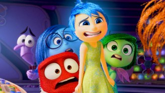
‘Inside Out 2’: Everything To Know About The Pixar Sequel Including The New Emotions And Concept Art
Arkasha Stevenson On ‘The First Omen’ And The Scene That Got Her An NC-17
A Lovely Chat With Walton Goggins About ‘Fallout,’ ‘Justified,’ And Being A Solitary Man
Culture
will.i.am Launches FYI, The World’s First AI-Powered Messenger For Creative Collaboration
How Bail Bag Helps The Formerly Incarcerated Get Back On Their Feet
Advice From A Finance Pro For How To Survive (And Thrive) In This Economy
How will.i.am Developed ‘The Formula’ For The Future Of F1
Life/Style
UPROXX Life
Travel, Food, And Drinks On UPROXX
UPROXX Style
Style on UPROXX
The UPROXX Spring 2024 Travel Hot List
The Best Menu Hacks And Secret Menu Items At All The Big Fast Food Chains
‘Loud Budgeting’ Is The Savings Trend Taking Over TikTok In 2024
SNX: This Week’s Best Sneaker Drops Featuring The NOCTA Hot Step 2 Total Orange & Jordan 4 Vivid Sulfur
Sports
All Sports
Dime On UPROXX
NBA on UPROXX
UPROXX Edge
Gaming on UPROXX
UPROXX Brawler
MMA on UPROXX
Jamal Murray On Championship Lessons And What Makes The Nuggets So Tough To Guard Late In Games
Jemele Hill On The Media Response To Caitlin Clark And The Women’s Basketball Boom
We Undersold How Good Victor Wembanyama Would Be As A Rookie
Drinks
All Drinks
Whiskey & Spirits
Whiskey & Spirits On UPROXX
Beer
Beer On UPROXX
Cocktails
Cocktails On UPROXX
The Absolute Best Bourbons Under $125, Ranked
The Absolute Best Scotch Whiskies Under $125, Ranked
We Ranked Salty, Tart Gose Beers To Drink This Spring
This Honey Hop From Our Upcoming Austin Takeover Is The Ideal Bourbon Cocktail For Warmer Weather
Video/Podcasts
Josh Levi Returns To ‘UPROXX Sessions’ With A Swaggering Performance Of ‘She Keeps Comin’
Feminist Synth Lab Is Making Music Accessible For The Marginalized
Paramore’s ‘Misery Business’ Gets Approval From Chlöe And Sexyy Red In The Return Of ‘React Like You Know’
Ice Cube Joins Katty Customs and Just Blaze In The Latest Episode Of ‘Fresh Pair’
…
Follow
YouTube
Instagram
Twitter
Facebook
Flipboard
AppleNews
Email
Search for:
Search
Info
About
Privacy
Terms
Cookies Policy
COOKIES SETTINGS
'Fallout' Is A Freakishly Fun Take On The Apocalypse And Video Game Adaptation Genre
Walton Goggins and Ella Purnell lead this video game adaptation that doubles as the weirdest post-apocalyptic adventure we've seen recently.
On Your Screens
A Lovely Chat With Walton Goggins About ‘Fallout,’ ‘Justified,’ And Being A Solitary Man
April 3, 2024
by:
Jason Tabrys
Amazon’s ‘Mr. & Mrs. Smith’ Is The Reimagining You Didn’t Know That You Wanted
February 1, 2024
by:
Kimberly Ricci
For The Love Of Movies
‘Inside Out 2’: Everything To Know About The Pixar Sequel Including The New Emotions And Concept Art
April 16, 2024
by:
Josh Kurp
Arkasha Stevenson On ‘The First Omen’ And The Scene That Got Her An NC-17
March 27, 2024
by:
Mike Ryan
The Latest
The 30 Funniest Shows On Netflix Right Now (May 2024)
April 25, 2024
by:
Nina Braca
and
Kimberly Ricci
The Latest Update On The ‘Peaky Blinders’ Movie Is Welcome News For Cillian Murphy Fans
April 25, 2024
by:
Nina Braca
How Is ‘Dead Boy Detectives’ Connected To ‘The Sandman’ On Netflix?
April 25, 2024
by:
Kimberly Ricci
‘The Lord Of The Rings’ Extended And Remastered Editions Are Coming To Theaters For The First Time
April 25, 2024
by:
Josh Kurp
The 25 Best Shows On Disney Plus Right Now (May 2024)
April 25, 2024
by:
Mike Redmond
Featured
Anthony Boyle On 'Manhunt,' Not Being Changed By Success, And Why Irish Actors Nail American Accents
by:
Jason Tabrys
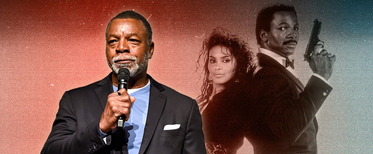
In Honor Of Carl Weathers It’s Time For You To Watch ‘Action Jackson’
by:
Mike Ryan
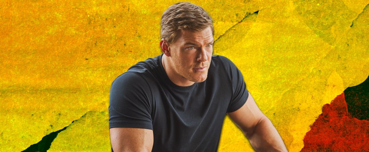
Every Episode Of ‘Reacher,’ Basically
by:
Brian Grubb
'Argylle' Is Absurd, Ridiculous Fun
by:
Mike Ryan
‘The Beekeeper’ Is So Dumb And Ridiculous That It’s Kind Of Terrific
by:
Mike Ryan
Greta Gerwig On The Stunning Success Of ‘Barbie' And Her Unabashed Love For Sly Stallone
by:
Mike Ryan
John Cho On 'The Afterparty,' Shower Singing, And How He Defines A Successful Project
by:
Jason Tabrys
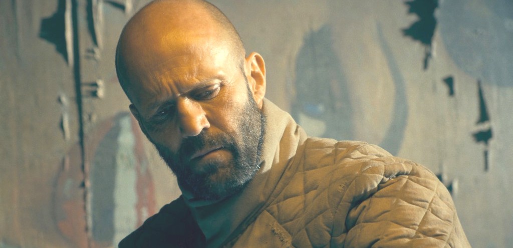
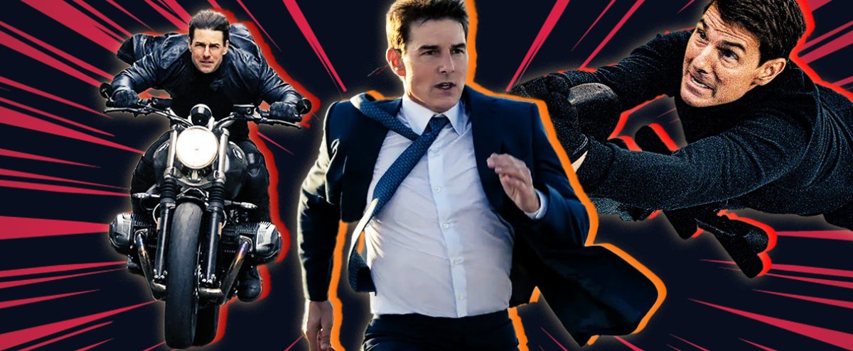
The Films Of The 'Mission: Impossible' Franchise, Ranked
by:
Brian Grubb
John Boyega On 'They Cloned Tyrone' And Why He Needs A 'Bridgerton' Of His Very Own
by:
Jessica Toomer
A Deep Dive Into The Season Two Soundtrack Of 'The Bear' With The Guys Who Curated It
by:
Steven Hyden
Talkin' About 'Righteous Gemstones' And TV-Watchin' With John Goodman And Walton Goggins
by:
Jason Tabrys
The Best Television Shows Of 2023 (So Far)
by:
UPROXX Entertainment
The Best Movies Of 2023 (So Far)
by:
UPROXX Entertainment
The Villains Of The Original 'Justified' Series, Ranked From Crowe To Crowder
by:
Brian Grubb
Inside The Making Of ‘Indiana Jones And The Dial Of Destiny’
by:
Mike Ryan